Introduction
For this assignment we have been asked to reflect over the 3 years of the course from the beginning to end, and highlight our journey through an exhibition, blog and portfolio.
I would like to start my journey from the work that I placed in a portfolio for my interview to gain a place on the degree, then create a timeline to generate a blog that shows my journey, task's varying genres and my growth as a photographer and the techniques that I have developed in.
Inclusive to the timeline will be a range of photographers that I have researched as I feel that this has played a key part to my work as a photographer, for example, the techniques that I have put into my own practice, different genres that I have inspired to be part of, thus reducing the risk of my work becoming static and very similar to the point of it becoming non interesting to the viewers eye.
In addition to this the research has helped create an awareness of finding that something beautiful in something that at first sight can appear rather bland and ugly. And how to post produce an image to compliment the subject to its highest standard.
The past 3 years I find have been very challenging to my self both as a student and as a commissioned photographer, some briefs and commission's have been very open and ambiguous and it has been an eye opener into how many different images, angles, techniques and post production methods have to be included to capture that one perfect image that has met the need's of the person (s) setting the task.
In turn briefs and commissions that are very restricted and structured I feel can also be just as challenging, this is due to the photographer creating something beautiful and unique to contrast against the image which I sometimes have felt is quite standard, but it is the standard that the customer wants and this can sometimes feel that it goes against the grain of what you are as a photographer, but as the saying goes 'the customer is always right'.
The remainder of my blog will showcase my work and I hope you enjoy viewing my personal journey.
Year 1
Was a year of plenty of introductions into new development's of camera technique's, lighting balances, dark room printing and building up business skills. The year was full of plenty of lectures (including Art History), seminars group tasks and practical sessions, the Set tasks and brief's whole correlated well together to further enhance my understanding of photography in general please see below for images that have been produced as part of year one.
Systems and Processes
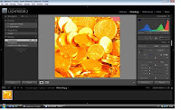
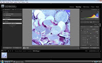
We uploaded images into Lightroom, we altered the tone of the image's through the development menu. If you slide the temperature bar all the way to the left, this makes the image COOL, whereas, if you slide it all the way to the right, this makes the image WARM. You can also see this on the Histogram. The Cool image makes it cold and full of blue tones, and lacking in reds and warm colour, whereas the opposite is true of the warm tones.
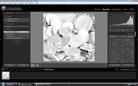
The greyscale is produced by clicking the greyscale tab which simply desaturates the image to black and white.
.
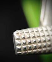
Example of an image I took using a soft box diffuser

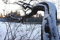
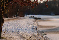
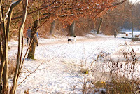
Snow Location Photography
These were taken in Germany before Christmas, when it was minus 20 degrees. The lake had frozen. This was at Magic Hour and I think the light is really special giving a soft glow to the pictures, and avoiding any over exposure issues which you can get with snow being so reflective.
I particularly like the tree the way it is all bent over and twisted, leading the eye to the sunset.
History of Art
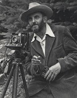
During year 1 we attended lectures and seminars that was delivered by lecturer Chris Aughton, I thoroughly enjoyed these lectures for 2 reason's the subject matter was so interesting and relevant to photography and I was completely engaged in the learning as it interested me so much. The second reason was due to the way that it was delivered Chris has a unique style to teaching and I have never enjoyed a lecture as much I enjoyed his he managed to capture both formal and informal at the same time, below are some examples of the history research that I studied.
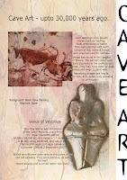 Some of the earliest known art was discovered in Caves where man daubed images on the walls using clays, charcoals and earth colours. For my timeline I am using Layers in Photoshop CS4 to build up images of different genres of art through the ages.
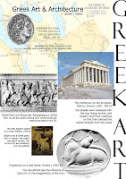 This was a layered image that I created for my time line.
The following is the time line that I created:
Objects Brief
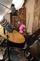
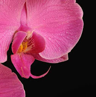
This was my set up for taking an organic form, in this case it was an Orchid. I set it against a black background on a studio still life table, and using a 2 brolly set up at 45 degree angles overhead, and a gold reflector underneath to give it a bit of warmth. The original image was taken with a Nikon D700 SLR, with a 24 - 70mm f.2.8 telephoto lens, at a focal length of 70mm, ISO 200 and an aperture of f.18 and 1/200 the second exposure, using studio flash.

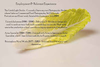
My Creative CV
Part of our year 1 brief was to create a CV that we can use for job vacancies and advertising below is my CV that I created, this has been good to look back on for a reflective piece as my CV has grown alot since then
.

Year 1 AOP Competition entry
Here is my final submission for this years 2010 AOP Student Awards. You can find out more about the Association of Photographers, and the competition itself including previous winners by clicking on this link.

In year 1 we did an objects brief below is some examples of my final images.

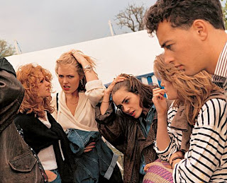
People Colour images was directed through both theory and practice this was taught by Andy Farrington below are some of the images that was taken and post produced in practical studio time.During this time we learnt that how you save your image is important, depending on the application it is going to be used for. Saving your image as Adobe RGB is good for greens and colours, so especially good for landscape shots with a lot of green in, sRGB is a good all round file for web viewing, whereas Prophoto is quite flat.


Fine Art Refining Practice Brief
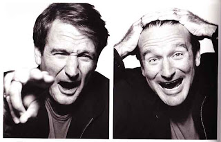
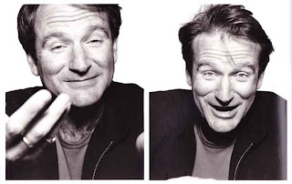
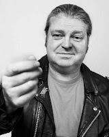
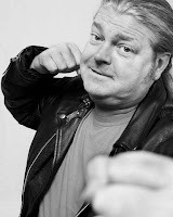
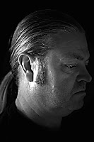
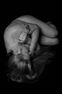
I chose to do self portraits for my fine art, the reason that I have chose to do self portraits is that I feel that this shows emotion, this meaning that I can express my self emotions/feelings more than asking another person to try and show my emotion for me as they can not feel what I am feeling, therefore it is not a true representation of the human condition of emotions whether these be happy, sad, moody, angry and sexy etc...
I have chosen to replicate the images of Patrick Demarchelier and his portraits of Robin Williams, as I feel that these are great examples of emotions.
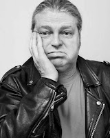
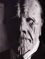 This is another portrait image from Patrick Demarchelier, although it is different to those of Robin Williams I wanted to include as it I feel that this image is very hard to perceive whether the subject is showing ant emotion at all!!!! The hard to read face which is another major feature which many humans have as a condition. The image was taken by using side lighting this adds to the whole atmosphere (interesting yet menacing).
From this research I tried to replicate the portrayal of the human condition, firstly it was important to get the set up right, below is an example of how I did this.
 This a photograph of the set up that i used for the short lighting method, which leaves a short shadow underneath the nose and under the chin, as opposed to the butterfly/Rembrandt lighting method. I used a Bowens light set up i.e the brolley which is the key light using the flash, which bounces of the silver reflector thus causing the shadow under the nose because the key light is both higher than the subject and in front of the subject. I found that this set up was difficult to set up in order to gain the right shadow and definition as there was a lot of light moving around but I feel that I did in the end master it to a certain extent. All the images were taken using a Nikon D700, with 85mm portrait lens.
I researched different lighting methods these were my findings:
Rembrandt portrait lighting is a name given to the lighting effect that the old masters used to use for the lighting effects in many of his paintings. It's basically short lighting where the shadow from the nose connects with the shadow on the side of the face, thus creating a triangle of light on the short side of the face. If nose and shadow does not connect with the cheek it's not considered to be rembrandt lighting, just short lighting.
Alot of fine art images are finished in black and white it could be suggessted that the final images portray the mood better in black and white than they do in colour.
 http://www.professionalphotography101.com/portrait_lighting_names.html/
My replicated human condition self portraits
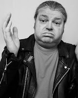
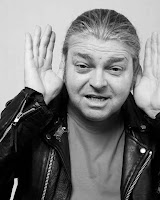
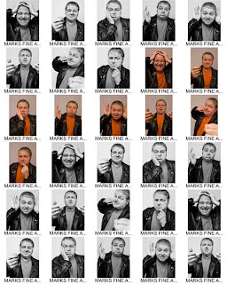
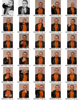
I thoroughly enjoyed this brief self portrait was an area that I had never done before, and I think emotions are evident in all of the images.
Module 2 Unit 5 The Human Condition People
I researched David Bailey for this module
http://www.davidbaileyphotography.com/
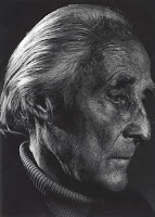
This portrait of Bill Brandt by David Bailey , taken in 1982, is a Bromide print, which fascinates me because it is a side portrait with a huge amount of contrast, and very up close and personal.
A Bromide print is one which uses paper containing Silver Bromide that is sensitive to light.
 This is take on the previous image of Bill Brandt taken by David Bailey. I have tried to recreate the lighting set up to reflect the very low key effect, using a single tungsten light and a silver reflector in front of the subject. Nikon D700 85mm focal length 85mm Nikon portraiture lens, 1.3 sec at f/3.3 SIO 200.
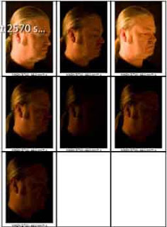
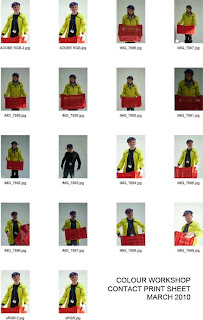
The above contact sheets is were I used Lightroom to organise my images, and them made a contact sheet in order to be able to review what I had taken, and select the images I wanted to work with.
 This image is a Fine Art style of Portrait, using a black low key backdrop, and 1/20th second at f1.6 using a 50mm portrait lens. This was a self portrait, which was quite successful because it brings out some of the elements of my character which are not normally visible.
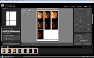
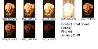 Here is the contact sheet I made using Photoshop CS3, Automate, Contact sheet II, which is the older version for this task, than CS4 which uses bridge. This allowed me to see which image was the best for my final portfolio, considering contrast, exposure and composition.
Candid People photography series of images
I researched Martin Parr for candid research photography before I took my images,
Martin Parr lives in Bristol his family were ornithologists this developed Parrs observational methods. He was inspired in the 60's by Bill Brandt and Henri Cartier- Bresson. He started his career at the sea-side and developed his prints in black and white, in the 80's he changed to colour and documtented the social hardship that the working class people experienced under the reign of Margerat Thatcher. He now focuses on the perception of everyday day living and is his work is social documentation of this. He has held a number of exhibitions including the Barbican Art Galleery 2002 his work is stated as grotesque, laughable and moving.http://www.pwcinculture.lu/32.0html
My below images form part of a series which I took around the town using my Fuji Fine Pix S2 ProSLR 35mm lens, combining a range of focal lengths and ISO's were kept as a standard 800 . When taking Candid shots of people, you have to be quite speedy and covert, otherwise they tend to either pose, or walk away if they object to having their photo taken. In order to do this it was necessary to set the camera to Shutter priority since you can never tell when your subject will move, then you may want to capture the action rather than get blurred images.
The above image was what I used a my final images for this unit. I used my Fuji FinePix S2Pro once again on Shutter priority, 35-80 mm lens, 72mm focal length, ISO 800, 1/750 sec at f/13. I think it works best in colour because it shows these two as colourful characters, whereas in black and white it adds to their age and takes the humour away from the shot.
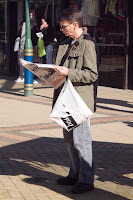
Corporate Portraiture
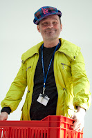
This brief worked well for my me as a photographer as I was able to incorporate commissioned work with College task work, and I was able to be directed both from my tutor and my client.

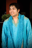
I took this image on Nikon d700 with an 85mm f1.4
lense at 1/160 sec at f8 and ISO 400, i used a single light set up with a brolly, with a bowens flash unit head. I like this finished image because it catches the person's ambience as he has paused for the camera.
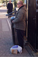
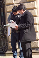
 I took this image on a Nikon d700 with 85mm lense on 1/125 sec at f10 ISO/400 i used single light with a brolly and Bowens flash unit. I think that this image captures his traditional dress (culture) Bangladeshi, I like how the blue colour of his dress has showed up really clear and bold. The image appears to have captured his natural look.
 I took this image on a Nikon D700 85 mm lens 1/125 sec
I took this image on a Nikon d700 with 85mm lense on 1/125 sec at f10 ISO/400 i used single light with a brolly and Bowens flash unit. I think that this image captures his traditional dress (culture) Bangladeshi, I like how the blue colour of his dress has showed up really clear and bold. The image appears to have captured his natural look. I took this image on a Nikon D700 85 mm lens 1/125 sec
at f.10 i have changed it to black and white using photoshop CS4 as the client wanted a black and white image for his portfolio, the image was also cropped to take out any background images that would distract the viewers eye from the subject.
The man wore stripey tie, a stripey shirt and a stripey suit jacket non of the stripes were the same in colour width or texture, the image being in black and white definitley helped the outcome of the image in terms of contrast.
Below is some research that I conducted before taking my brief images.
.
 I took this image on a Nikon D700 with 85mm lens 1/125 sec f.10, i used a twin light set up using a soft box and the brolley on the Bowen set up, the key light was the brolley on the left hand side. It was all mixed lighting as it was day light and flash, i moved the background plants/trees and used them as props.
 I took this image on a Nikon D700 85mm 1/125 sec f.10 using a twin light set up both the soft box and brolley the brolley was the key light on the left.
Environmental Portraiture
Before carrying out this brief I conducted research on Arnold Newman
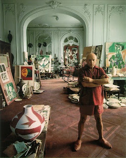 This is an environmental portrait that Newman took of Picasso in his natural working surroundings. I really like this photograph as i think that it is an excellent example of Arnolds work capturing both the true vocation and it definatley exhibits realism of the artists work. The colours of the art work really add to the composure of the image, the deatil on the background walls add to the grandity of the image.
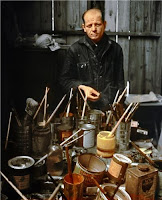 This is another photograph by Arnold Newman of Jackson Pollok I wanted to include this image as it really reflects Polloks environment of all his tins of paint that he used to splash around from, when i seen this photograph i could just imagine him doing his work.
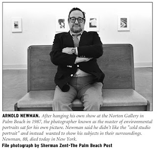 Arnold Newman studied art in 1936


Environmental Portraits
I enjoyed this brief as the images can be very misleading to the viewers please see my images below:
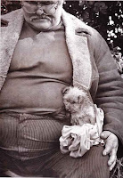 This is an image that I scanned I like it as it is like it has captured a homeless person in his environment, if the man is not homeless then the image is leading that train of thought.
Places introduction Alien Landscape
For example; this image, "Dust Breeding", by Man Ray shows an "alien" landscape as Man Ray wanted us to see it, but in fact it is a macro shot of dust.
You can view more of Man Ray's work at the following web link:
http://www.manray-photo.com/catalog/index.php
To capture the character of a place as you see it, and wanted to portray it may not always be true, but is dependant on the way you take your picture, and how you use the lighting, be it natural or added, the different lenses you use IE; wide angle will give you a sense of space, depth of field to give you perspective.
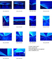
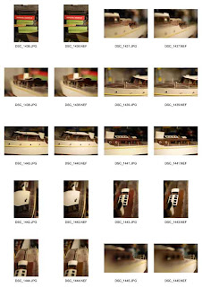
Contact sheets are really useful as a tool to be able to see all your images at once, to be able to choose your best image for your final portfolio.
I made this contact sheet using Photoshop CS4 Bridge, then selected the images I wanted in the sheet. From this I can now choose my best images.
.
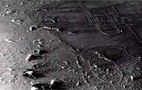
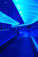
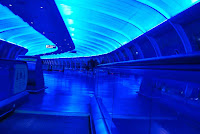
Here are a selection of my images for the alien or foreign environment which I took at Manchester airport , very early in the morning whilst it was still dark, to give the impression that you are on a spaceship, since it struck me that this was not unlike a spaceship that you see in the movies. The light interested me, because it gives you a sense of calmness because of the blue, cool tones. Because of the curve, IE; leading the eye, you can't wait to see whats around the next corner.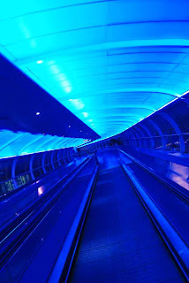 I used a Nikon D80 SLR here, ISO 1600 to capture any light trails and give a grainy effect because it is more sensitive to light capture. I used an 18 - 55mm short telephoto lens to allow me to alter my focal length depending on the image I wanted to create, and also this gave me a
Places a familiar place brief
I enjoyed taking the below images for this brief as my familiar place is the comfort of my garage of which holds all my life long treasures..... going through all my things again to find the perfect objects was a fun time and very nostalgic.
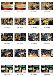
 CONTACT SHEETS
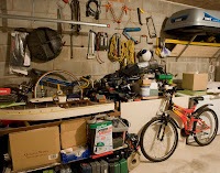 This is one of my favourite places. It might look like chaos to anyone else, but to me its my own organised chaos. I took this on a Nikon D700 SLR with a 24 - 70mm lens, focal length was 24mm, f.10/ 0.6 second on ISO 800, using a 200 watt Tungsten light.
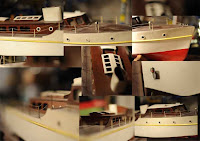 As part of my garage series of images of a familiar or significant place, this is a boat that I built as a boy. Throughout this brief I am using connecting lines to create images from a collection of other images. This leads the eye to different places within your image.
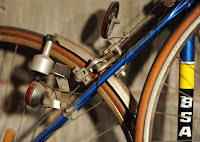 This is the first bike I bought with my first wage packet, which cost me £21, 32 years ago!
I like the composition of this image as the blue line takes your eye to the BSA logo, and the wheels cut the page in the rule of thirds. This was a Tour de France special bike with the trademark racing yellow and blue paint. Taken with a Nikon D700 DSLR, using a studio tungsten bulb, with the overhead 200watt bulb which gives a double shadow. f1.4, 1/100th of a second, ISO 800 and 85mm focal length lens.
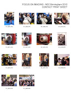
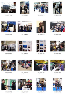
Part of being a photography student is to attend galleries and exhibitions below is some contact sheets from
the Birmingham NEC Exhibition that I attended.
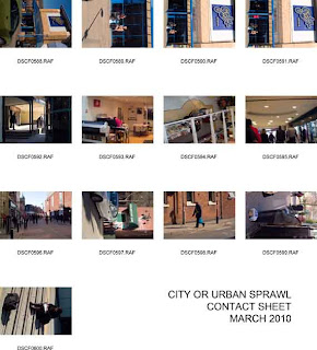
Places Urban Scrawl Brief
Below are my Contact Print Sheets for the City or Urban Sprawl unit. I went out around Blackburn town centre and took random candid shots using my fuji finepix nikon 35-80 mm short tele photo lens, which was the most suitable for different focal points when you don't have the opportunity to keep changing lenses. I also used a polarising filter to get deeper sky colours as it was good sunny day. When you use a Polarising filter, you need to adjust your aperture by a couple of stops for non sky work as otherwise your images will be under exposed
.
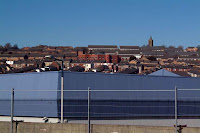
 This was one of my final images for this unit. I chose to take this building because it has now become an icon in the Blackburn landscape. Having changed the image to black and white I have decided it should be in colour because it has more character and blends with the sky. This was taken on my fuji finepix and 35 -80 mm lens 42mm Length ISO 800 1/1000 sec f/16 using a Polarising Filter. I used Photoshop CS4, lens correction filters to straighten the building line as I got Parallax error when I took the photograph
.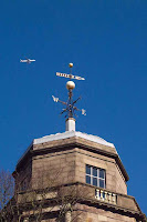 I liked this image of another of the defining landmarks in Blackburn. I think that the aeroplane looks odd because its not pointing quite the same way as the weather vane, but I like this image overall. This was taken with a Fuji Fine Pix S2Pro DSLR and a polarising filter on 51mm focal lens , 1/1750 sec f/ 13 ISO 800
.
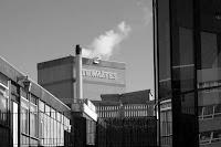 This photograph looks like it is made up of several images, because there is the old Thwaites chimney and factory, the working mans pub in the foreground and the modern glass building to the right, so overall I like the mix of times in the photo. This was taken on fuji fine pix , ISO 800 f/11 and shutter speed 1/500th second 35-80mm lens focal length 79 mm . I think this image works better in black and white because it adds to the feel of time.
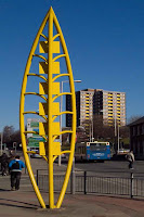
This was one of my final images for this unit. I like the weird composition from this awful combination of the bright yellow banana statue in the middle of the pavement, and the way that the council have sensitively painted the window boxes of the flats the same shade! Yellow and blue work well in this composition so I think the colour version is the better of the two.
This was taken on fujifinepix 35mm f/16with a polarising filter ISO 800 and 1/125th second.
 This image works because the sky and the building kind of act like layers sandwiching the town in between them. A series of images like this could possibly work as another complete project. Taken on fujifinepix with a 79mm lens using the widest angle. Shutter speed 1/125th, ISO 800 f/ 16 and a Polarising filter fro added saturation of the sky.
Wilderness/Countryside
For the next brief I researched Ansel Adams and his use of Large Format camera's as this is how I wanted to take my images. I enjoyed shooting the images for this brief being out in the countryside looking for the beauty in the peaceful natural beauty I found very calming and realxing.
.jpg) http://www.google.co.uk/search?hl=en&source=hp&q=ansel+adams+photography&meta=&aq=0&aqi=g10&aql=&oq=ansel+adams&gs_rfai==
http://www.google.co.uk/search?hl=en&source=hp&q=ansel+adams+photography&meta=&aq=0&aqi=g10&aql=&oq=ansel+adams&gs_rfai==
By Gone Times
This was my ultimate favourite brief I have been interested in steam trains since I was little, they have been a mass hobby of mine, so for me to be able to go and research the running of the trains today take pictures and speak to the workmen was one of the best moments of my life.
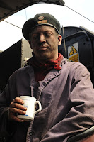
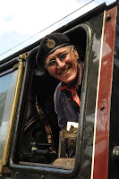 This image was taken for the pecha kucha brief, I chose to do steam trains as it is a great passionate hobby and interest of mine. This is one of the portraits I took of the steam driver, he is in his 80,s and he was the chief driver of the Duchess of Sutherland he does this as a volunteer, there are no longer any steam train drivers that are paid employees any more.
.jpg)
The man wore stripey tie, a stripey shirt and a stripey suit jacket non of the stripes were the same in colour width or texture, the image being in black and white definitley helped the outcome of the image in terms of contrast.
Below is some research that I conducted before taking my brief images.
.
I took this image on a Nikon D700 with 85mm lens 1/125 sec f.10, i used a twin light set up using a soft box and the brolley on the Bowen set up, the key light was the brolley on the left hand side. It was all mixed lighting as it was day light and flash, i moved the background plants/trees and used them as props.
I like this image as it makes him look suave and sophisticated trying to capture his percieved personality and I feel that the image contrasts really well.
I took this image on a Nikon D700 85mm 1/125 sec f.10 using a twin light set up both the soft box and brolley the brolley was the key light on the left.
I like this image they look well together and the trees/plants again make a good prop for the set up. Again i feel that the colours are contrasting.
Environmental Portraiture
Before carrying out this brief I conducted research on Arnold Newman
This is an environmental portrait that Newman took of Picasso in his natural working surroundings. I really like this photograph as i think that it is an excellent example of Arnolds work capturing both the true vocation and it definatley exhibits realism of the artists work. The colours of the art work really add to the composure of the image, the deatil on the background walls add to the grandity of the image. This is another photograph by Arnold Newman of Jackson Pollok I wanted to include this image as it really reflects Polloks environment of all his tins of paint that he used to splash around from, when i seen this photograph i could just imagine him doing his work.Arnold Newman studied art in 1936
at the University of Miami, he develpoed his photography when he started as an apprentice photographer. He was influenced by The Farm Security Administration and magazines such as Vanity Fair, his images reflect the subjects vocation and portray realism.
He was quoted as saying " we don't take photographs with our cameras, we take them with our hearts and minds. They are a reflection of ourselves, what we are, and what we think" (cited http://www.artgallery.com/) He printed his images in Black and White silver gelatin and used a 4*5 view camera on a tri-pod he later started use a srl 35mm , Newman used natural light for his images. http://www.agallery.com/pages/photgraphers/newman.html
My images Environmental Portraits
My images Environmental Portraits


Environmental Portraits
I enjoyed this brief as the images can be very misleading to the viewers please see my images below:
This is an image that I scanned I like it as it is like it has captured a homeless person in his environment, if the man is not homeless then the image is leading that train of thought.Places introduction Alien Landscape
For this brief I intended to show the character of various places through the medium of photography. The photographer has to show what he sees to the viewer, and project his thoughts which might not neccessarily be the truth, for example, the Alien landscape images I took do not actually show that you are on a spaceship, or an alien planet, but merely put across the sense of what I saw as an alien environment.
For example; this image, "Dust Breeding", by Man Ray shows an "alien" landscape as Man Ray wanted us to see it, but in fact it is a macro shot of dust.
You can view more of Man Ray's work at the following web link:
http://www.manray-photo.com/catalog/index.php
To capture the character of a place as you see it, and wanted to portray it may not always be true, but is dependant on the way you take your picture, and how you use the lighting, be it natural or added, the different lenses you use IE; wide angle will give you a sense of space, depth of field to give you perspective.
Contact sheets are really useful as a tool to be able to see all your images at once, to be able to choose your best image for your final portfolio.
I made this contact sheet using Photoshop CS4 Bridge, then selected the images I wanted in the sheet. From this I can now choose my best images.
.
Here are a selection of my images for the alien or foreign environment which I took at Manchester airport , very early in the morning whilst it was still dark, to give the impression that you are on a spaceship, since it struck me that this was not unlike a spaceship that you see in the movies. The light interested me, because it gives you a sense of calmness because of the blue, cool tones. Because of the curve, IE; leading the eye, you can't wait to see whats around the next corner.
 I used a Nikon D80 SLR here, ISO 1600 to capture any light trails and give a grainy effect because it is more sensitive to light capture. I used an 18 - 55mm short telephoto lens to allow me to alter my focal length depending on the image I wanted to create, and also this gave me a
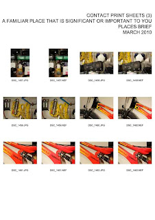
Places a familiar place brief
I enjoyed taking the below images for this brief as my familiar place is the comfort of my garage of which holds all my life long treasures..... going through all my things again to find the perfect objects was a fun time and very nostalgic.
CONTACT SHEETS
Here are the contact sheets of my photo shoot of the above brief title.
Contact sheets are a good idea so that you can look and pick the best photographs to use from one place.
This is one of my favourite places. It might look like chaos to anyone else, but to me its my own organised chaos. I took this on a Nikon D700 SLR with a 24 - 70mm lens, focal length was 24mm, f.10/ 0.6 second on ISO 800, using a 200 watt Tungsten light. As part of my garage series of images of a familiar or significant place, this is a boat that I built as a boy. Throughout this brief I am using connecting lines to create images from a collection of other images. This leads the eye to different places within your image. This is the first bike I bought with my first wage packet, which cost me £21, 32 years ago!I like the composition of this image as the blue line takes your eye to the BSA logo, and the wheels cut the page in the rule of thirds. This was a Tour de France special bike with the trademark racing yellow and blue paint. Taken with a Nikon D700 DSLR, using a studio tungsten bulb, with the overhead 200watt bulb which gives a double shadow. f1.4, 1/100th of a second, ISO 800 and 85mm focal length lens.
Part of being a photography student is to attend galleries and exhibitions below is some contact sheets from
the Birmingham NEC Exhibition that I attended.
Places Urban Scrawl Brief
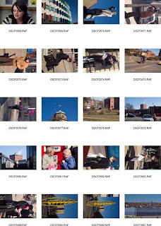
Below are my Contact Print Sheets for the City or Urban Sprawl unit. I went out around Blackburn town centre and took random candid shots using my fuji finepix nikon 35-80 mm short tele photo lens, which was the most suitable for different focal points when you don't have the opportunity to keep changing lenses. I also used a polarising filter to get deeper sky colours as it was good sunny day. When you use a Polarising filter, you need to adjust your aperture by a couple of stops for non sky work as otherwise your images will be under exposed
.
This was one of my final images for this unit. I chose to take this building because it has now become an icon in the Blackburn landscape. Having changed the image to black and white I have decided it should be in colour because it has more character and blends with the sky. This was taken on my fuji finepix and 35 -80 mm lens 42mm Length ISO 800 1/1000 sec f/16 using a Polarising Filter. I used Photoshop CS4, lens correction filters to straighten the building line as I got Parallax error when I took the photograph.
I liked this image of another of the defining landmarks in Blackburn. I think that the aeroplane looks odd because its not pointing quite the same way as the weather vane, but I like this image overall. This was taken with a Fuji Fine Pix S2Pro DSLR and a polarising filter on 51mm focal lens , 1/1750 sec f/ 13 ISO 800.
This photograph looks like it is made up of several images, because there is the old Thwaites chimney and factory, the working mans pub in the foreground and the modern glass building to the right, so overall I like the mix of times in the photo. This was taken on fuji fine pix , ISO 800 f/11 and shutter speed 1/500th second 35-80mm lens focal length 79 mm . I think this image works better in black and white because it adds to the feel of time. This was one of my final images for this unit. I like the weird composition from this awful combination of the bright yellow banana statue in the middle of the pavement, and the way that the council have sensitively painted the window boxes of the flats the same shade! Yellow and blue work well in this composition so I think the colour version is the better of the two.
This was taken on fujifinepix 35mm f/16with a polarising filter ISO 800 and 1/125th second.
This image works because the sky and the building kind of act like layers sandwiching the town in between them. A series of images like this could possibly work as another complete project. Taken on fujifinepix with a 79mm lens using the widest angle. Shutter speed 1/125th, ISO 800 f/ 16 and a Polarising filter fro added saturation of the sky.Wilderness/Countryside
For the next brief I researched Ansel Adams and his use of Large Format camera's as this is how I wanted to take my images. I enjoyed shooting the images for this brief being out in the countryside looking for the beauty in the peaceful natural beauty I found very calming and realxing.
http://www.google.co.uk/search?hl=en&source=hp&q=ansel+adams+photography&meta=&aq=0&aqi=g10&aql=&oq=ansel+adams&gs_rfai==
Ansel Adams (1902-84), his photographs were first published in 1921 Ansel wanted his images to show close up detail and the best view points. He had a 60 year career which included large forms and factories these were taken on a view camera, which is a large format camera.
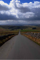 I took this image on Nikon D80, using a 18-55mm f3.5- 5.6 lense focal length 31 mm f/ 9.0 at 1/320 sec on ISO 125 using a polarising filter. I feel that i took this like an Ansel Adams and there was no other cars on the road, so I used the road as leading line, I am quite pleased with the image as I feel that the clouds give the image dramatics.
.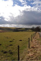 I took this image on a D80, 18-55 mm short telephoto lense, focal length 18mm f/9.0 1/320 sec ISO 125. I used the fence as leading line for the image as it divides the picture into thirds.
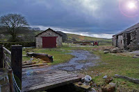 I took this photograph on a Nikon D80. focal length 18mm -55mm, 1/160 SEC f/6.3ISO 125. This photograph was took because I thought that the composition was interesting with the tractor in the background. It shows the image running down the side of the dilapidated farm in the Dales the sun flare was left in the image as I feel that it adds to the overall finish.
I took this image on Nikon D80, using a 18-55mm f3.5- 5.6 lense focal length 31 mm f/ 9.0 at 1/320 sec on ISO 125 using a polarising filter. I feel that i took this like an Ansel Adams and there was no other cars on the road, so I used the road as leading line, I am quite pleased with the image as I feel that the clouds give the image dramatics..
I took this image on a D80, 18-55 mm short telephoto lense, focal length 18mm f/9.0 1/320 sec ISO 125. I used the fence as leading line for the image as it divides the picture into thirds. I took this photograph on a Nikon D80. focal length 18mm -55mm, 1/160 SEC f/6.3ISO 125. This photograph was took because I thought that the composition was interesting with the tractor in the background. It shows the image running down the side of the dilapidated farm in the Dales the sun flare was left in the image as I feel that it adds to the overall finish.By Gone Times
This was my ultimate favourite brief I have been interested in steam trains since I was little, they have been a mass hobby of mine, so for me to be able to go and research the running of the trains today take pictures and speak to the workmen was one of the best moments of my life.
This image was taken for the pecha kucha brief, I chose to do steam trains as it is a great passionate hobby and interest of mine. This is one of the portraits I took of the steam driver, he is in his 80,s and he was the chief driver of the Duchess of Sutherland he does this as a volunteer, there are no longer any steam train drivers that are paid employees any more.
The image was taken on DSLR Nikon d700 using 24-70 mm telephoto lens, ISO 1600 I used this to get as much grain into the image as possible as I thought that it was fitting with the grubbiness of the image 1/100 sec at f/22.
 This image was taken using DSLR 700, iso 1600, focal length of 60 mm, exposure was 1/125 sec at f/18. This was to show just how dirty the train drivers get.
 This image was taken using ISO1600, 1/80 SEC F/4 with the image being taken on the inside by using the ISO 1600 it was able to capture any available light.
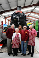 This image was taken using a DSLR 700, 35mm focal length, ISO 4000, 1/125 at f/6.3. I shot this image as it shows the team of the museum all of which are volunteers.
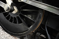 I took this picture as i like how it show's the elements of the wheel, the emphasis of the image is to show that steam trains run on steel wheels.
This image was taken using DSLR 700, iso 1600, focal length of 60 mm, exposure was 1/125 sec at f/18. This was to show just how dirty the train drivers get. This image was taken using ISO1600, 1/80 SEC F/4 with the image being taken on the inside by using the ISO 1600 it was able to capture any available light. This image was taken using a DSLR 700, 35mm focal length, ISO 4000, 1/125 at f/6.3. I shot this image as it shows the team of the museum all of which are volunteers. I took this picture as i like how it show's the elements of the wheel, the emphasis of the image is to show that steam trains run on steel wheels.
The image was taken using a DLSR 700, ISO 4000, focal length 24mm, 1/100 at f/2.8. I feel that the picture gives a good close up range.
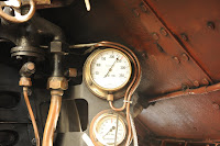
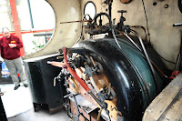 This is a photograph of the inside of a tender which is to be restored. I like this image because it show's the workings and the pipe work of the boiler before its restored therefore it is in its dilapidation.
This is a photograph of the inside of a tender which is to be restored. I like this image because it show's the workings and the pipe work of the boiler before its restored therefore it is in its dilapidation.
The image was taken using a DSLR 700, ISO 4000, focal length 24mm, 1/100 sec at f/2.8.
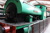
 This is an external view of the fire tender that is to be restored, this shows the external dilapidation of the paint work and the project to be getting on with.
This is an external view of the fire tender that is to be restored, this shows the external dilapidation of the paint work and the project to be getting on with.
The image was taken using a DSLR 700, focal length 27mm, ISO 800, 1/100 sec at f/5.6.
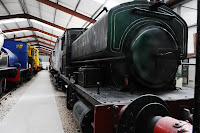
 This is a photograph of a fully restored engine I like this image because it shows the finished product after work has been carried out on it which in some cases takes years.
This is a photograph of a fully restored engine I like this image because it shows the finished product after work has been carried out on it which in some cases takes years.
The image was taken using DSLR 700, ISO 4000, focal length 32 mm, 1/80 sec at f/6.3.
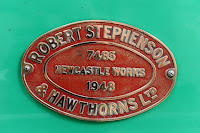 This is a photograph of the engine name plate that has just been restored showing that the steam engine was built in 1948 in Newcastle by Robert Stephenson and Hawthorns Ltd. I like the image because the actual name plate is a piece of history highlighting when it was made and the number 7458 is it's registration number.
This is a photograph of the engine name plate that has just been restored showing that the steam engine was built in 1948 in Newcastle by Robert Stephenson and Hawthorns Ltd. I like the image because the actual name plate is a piece of history highlighting when it was made and the number 7458 is it's registration number.
The image was taken using a DSLR 700, ISO 4000, focal length 50 mm, 1/80 at f/6.3.
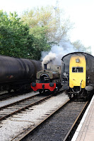 This is a photograph of a small tender coming up the tracks to pull the carriages, I like this image because the steam creates movement it looks like an old dinosaur working.
This is a photograph of a small tender coming up the tracks to pull the carriages, I like this image because the steam creates movement it looks like an old dinosaur working.
The image was taken using a DSLR 700, ISO 800, focal length 70mm, exposure 1/100 sec at f/14.
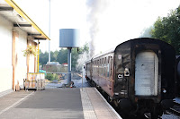 This is a photograph of the train pulling away that's a memory in all children's minds of an epic journey that they once had, I like this because it brings back childhood memories.
This is a photograph of the train pulling away that's a memory in all children's minds of an epic journey that they once had, I like this because it brings back childhood memories.
The image was taken using a DSLR 700, ISO 800, focal length 70 mm, 1/160 sec at f/5.6.
Phew year 1 was a very busy year practically I have enjoyed gathering all the blog images and reflecting over my journey.
Phew year 1 was a very busy year practically I have enjoyed gathering all the blog images and reflecting over my journey.